GARDENS OF THE FUTURE
Branding Y 2021

A rebranding concept created for the garden
landscaping and maintenance company Gardens of The Future. Looking through their
contemporary portfolio and ideas lead design qualities it was clear the
approach needed to match.
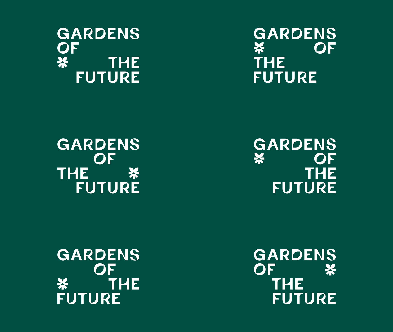
The design consists of 2 main elements: a brand mark – simplification of the transformative nature of the job; an arrow shaped roots going through the ground turning into leaves. And typography – built incorporating the leaf shape from the symbol in every letter. As no two gardens are the same both elements are together laid out in numerous variations informing further logo layout principles for other brand pieces of communication.
The design consists of 2 main elements: a brand mark – simplification of the transformative nature of the job; an arrow shaped roots going through the ground turning into leaves. And typography – built incorporating the leaf shape from the symbol in every letter. As no two gardens are the same both elements are together laid out in numerous variations informing further logo layout principles for other brand pieces of communication.


Y 2025