TESCO KIDS
Branding, Y 2017

A
new look and feel for the kids range at Tesco Cafe was needed to drive
awareness of new kids’ meals offered.
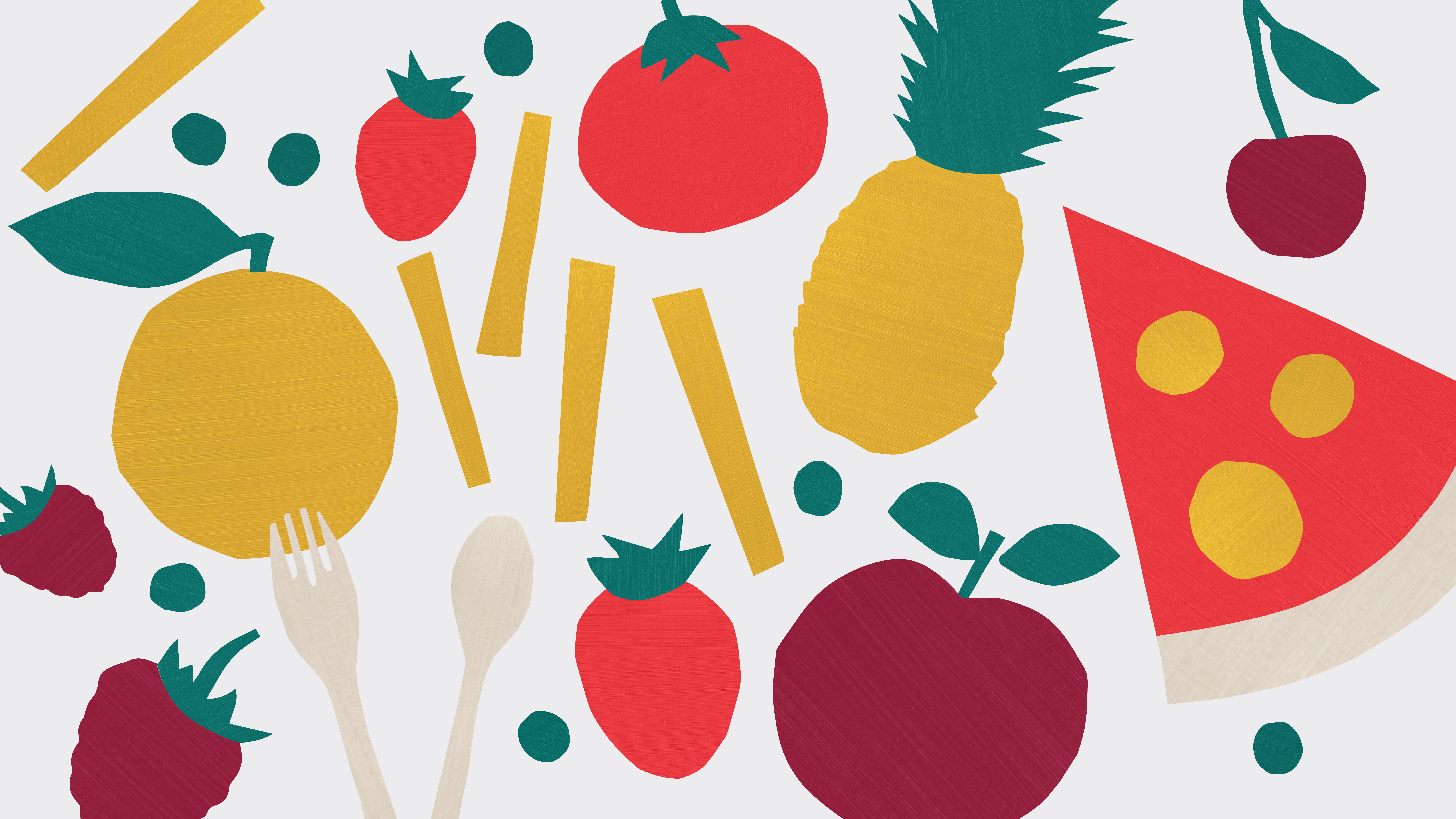
As a sub brand of the Tesco Café it was important for the identity to feel unique, fun and playful whilst keeping the essential elements of the master brand. To start with, the colour palette was adjusted to be brighter and more vibrant version of the Tesco Café colour scheme. As the main brand characteristic, a “hand cut” treatment was introduced to adjust already existing Tesco Café elements creating a bespoke Kids personality. This style was used to create a new brand mark, establish an illustration style and to even create a bespoke looking typeface to then use when creating photography art direction and other promotional materials.
As a sub brand of the Tesco Café it was important for the identity to feel unique, fun and playful whilst keeping the essential elements of the master brand. To start with, the colour palette was adjusted to be brighter and more vibrant version of the Tesco Café colour scheme. As the main brand characteristic, a “hand cut” treatment was introduced to adjust already existing Tesco Café elements creating a bespoke Kids personality. This style was used to create a new brand mark, establish an illustration style and to even create a bespoke looking typeface to then use when creating photography art direction and other promotional materials.


Y 2025